Let’s be honest for a minute. You can have a solid product, something you really believe in, and still struggle to make a single sale online. You post it, maybe run a bit of traffic, share it on social media… and then nothing meaningful happens. A few visits here and there, but no real conversions.
Within seconds, someone decides if they trust what they’re seeing or if they’re going to leave. If your page is slow, messy, overloaded, or just confusing, you’ve already lost them before they even read a full sentence.
Why most landing pages fail?
A big mistake I keep seeing is overcomplicating the design. People think adding more effects, more libraries, more animations will make things look “professional.” In reality, it usually does the opposite.
Heavy frameworks and unnecessary scripts slow everything down. – A delay of even a couple of seconds can reduce conversions dramatically.
A landing page should do one job: guide the visitor toward a decision without distraction. That’s it.
Simple always wins:
Show what the product is
Explain why it matters
Make the next step obvious
That’s the structure behind every page that actually converts well. Not endless sections. Not fancy visual tricks. Just clarity.
This is why lightweight templates built with clean HTML, CSS, and minimal JavaScript often outperform complex setups. They load faster, behave better on mobile, and keep the focus where it should be: the message.
What a high-converting page actually needs?
Instead of trying to impress visitors, you need to guide them. A strong landing page usually includes a few key elements:
- A clear hero section that explains the value in seconds. Not paragraphs—just direct messaging that answers “what is this and why should I care?”
- A problem section that reflects what the user is already struggling with. If they feel understood, they stay longer.
- A solution section that connects your product directly to that problem without overexplaining.
- And finally, a simple call-to-action. No confusion. No extra steps. Just one clear direction.
A practical template approach
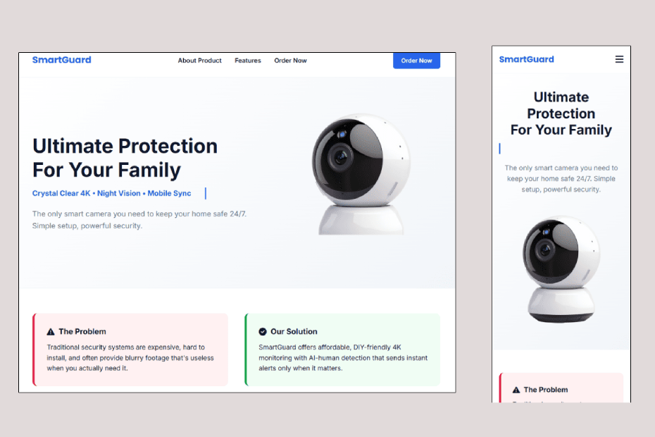
A good modern template (like the “SmartGuard” style layout many developers use) focuses on structure instead of decoration. It removes unnecessary weight and keeps performance as the priority.
It usually includes:
- A fast-loading hero area
- A clean product explanation section
- A problem/solution layout
- A simple order or signup form
- Mobile-first responsive design
Nothing extra. Nothing distracting.
Free Product Landing Page Template 2026 :
If your landing page isn’t converting, don’t rush to change your product or your marketing. Start with the page itself. In many cases, simplifying the structure and improving speed alone can completely change your results.
A landing page isn’t supposed to “look impressive.” It’s supposed to sell clearly and quickly.